INDUSTRY HUB
ABOUT
CONTACT
HOME

Services Provided

Logo Design 

Re-Branding Visual Design

Animation Advertising


Sorted, a UK-based delivery platform offering postage and shipping management software for retailers and brands, needed a refined brand identity to match their expanding presence. Their existing visual identity lacked strategic direction: the logo conveyed the wrong message, and the colour palette failed to reflect the nature of their services. The brand needed a system that could communicate clarity, confidence, and capability — without relying on overused visual language seen across competitors.


Complicating the process were strict visual constraints: key colours such as red, pink, and anything too closely aligned with industry competitors were off-limits. Rather than hinder the outcome, these restrictions became a creative anchor, guiding a more focused and original solution. 


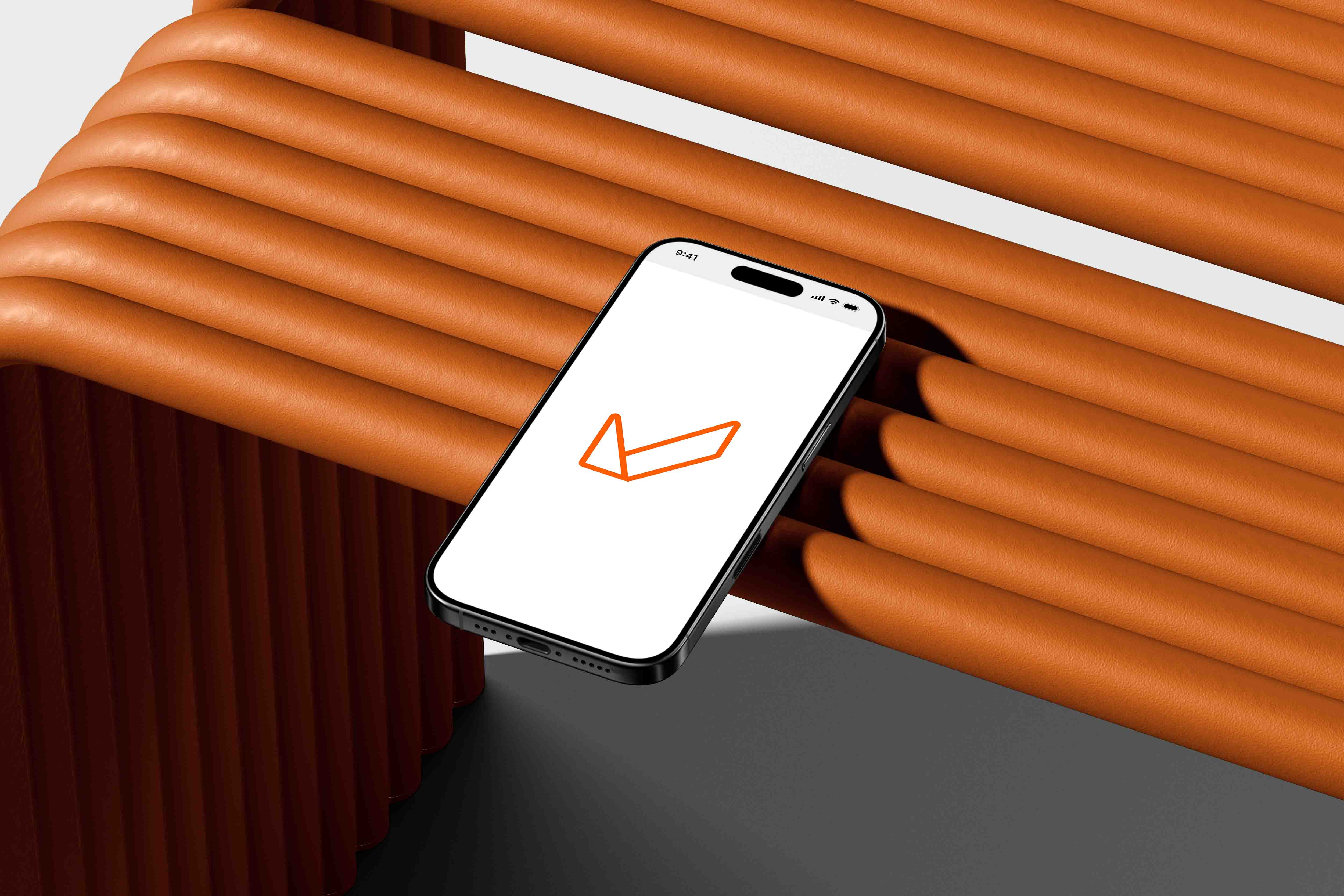
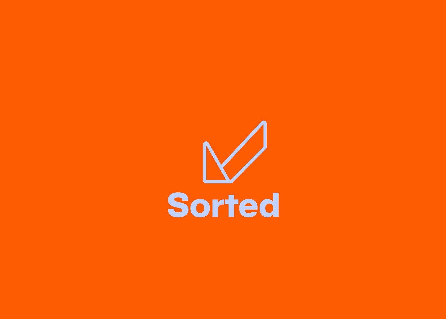
The new identity centred around a minimalist logo icon that distilled three key ideas into a single visual form: 

Speed and mobility — represented by a bird in flight 

Success and completion — conveyed via a checkmark

Postage and communication — echoed in the silhouette of a folded envelope 

Together, these elements communicate the core promise of Sorted: reliable, streamlined delivery. 

The accompanying typographic system balances modernity with approachability, while the new colour palette references heritage postal tones — specifically a bold, postal-inspired orange — reimagined with a contemporary edge.

Delivery

On Time,

Everytime…

Delivery

On Time,

Everytime…

Delivery

On Time,

Everytime…

Sorted's Brand Performance

KPIs

Impact & Outcomes


 Following the brand identity redesign in 2021, Sorted experienced significant growth and industry recognition:


- SaaS Platform Expansion: 2021 marked a 243% growth in shipments through Sorted's SaaS platform compared to the same month in the previous year.


- Global Recognition: Sorted was named by the Financial Times as one of the fastest-growing companies in Europe. 


- Funding Milestones: In 2021, Sorted raised $40 million in a Series C investment round, following a $15 million raise earlier that year, bringing total funding to nearly $100 million. 


- Notable Client Collaborations: Post-rebrand, Sorted secured partnerships with leading retailers including M&S, ASOS, Dunelm, Go Outdoors, and Music Magpie.


These outcomes underscore the effectiveness of the rebranding initiative in enhancing Sorted's market position and appeal to top-tier clients.

ENTER LORE LOGO STUDIO

Tech & AI

Industrial

Corporate

F&B +Hospitality

Transport

Entertainment

Medical & Science

Fashion & Apparel

NGO's & Culture

© 2026 LORE DESIGN. All rights reserved. No design may be used, copied, modified, reproduced, or distributed without prior written permission from LORE DESIGN. Unauthorized use, including imitation or derivative works, will be subject to legal action.