INDUSTRY HUB
ABOUT
CONTACT
WORK

(WEBSITE UNDER FIRST STAGE PROTOTYPING)

(WEBSITE UNDER FIRST STAGE PROTOTYPING)

SERVICES BY LORE.

SERVICES BY LORE.

LOGO DESIGN

BRAND IDENTITY DESIGN

UI DESIGN + ANIMATION

LOGO DESIGN

BRAND IDENTITY DESIGN

UI DESIGN + ANIMATION

LOGO DESIGN

BRAND IDENTITY DESIGN

UI DESIGN + ANIMATION

Located just outside Finsbury Park Station in North London, this contemporary dance studio offers a versatile space for dance classes, rehearsals, workshops and filming. With professional facilities, flexible hourly studio hire and spaces suited to dancers, instructors and creative professionals, the venue also accommodates content creation and private events.


LORE was commissioned to develop the logo design and wider brand identity, establishing a distinctive and cohesive visual language that has since been implemented across the business. Extending this visual identity into a digital environment, a fully realised website design has also been developed as a concept, demonstrating how the brand could translate into a cohesive online experience. While the website remains conceptual, its design has been carefully considered from a UI and usability perspective, with a structured grid system, clear visual hierarchy and responsive layout principles established to support potential future implementation.

Tools Utilised

SECTION 1: LOGO + BRAND IDENTITY DESIGN

LOGO DESIGN CONSTRUCTION

LOGO DESIGN CONCEPT

ADAPTABLE TYPE SYSTEM

ADAPTABLE TYPE SYSTEM

SELECTED TYPE

SELECTED TYPE

HELVETICA

LIGHT


HEADER 21 pt

ABCDEFGHIJKLM

NOPQRSTUVWXYZ

abcdefghijklm

nopqrstuvwxyz

1234567890


Body 10pt

ABCDEFGHIJKLM

NOPQRSTUVWXYZ

abcdefghijklm

nopqrstuvwxyz

1234567890

HELVETICA

LIGHT


HEADER 21 pt

ABCDEFGHIJKLM

NOPQRSTUVWXYZ

abcdefghijklm

nopqrstuvwxyz

1234567890


Body 10pt

ABCDEFGHIJKLM

NOPQRSTUVWXYZ

abcdefghijklm

nopqrstuvwxyz

1234567890

HELVETICA

LIGHT


HEADER 21 pt

ABCDEFGHIJKLM

NOPQRSTUVWXYZ

abcdefghijklm

nopqrstuvwxyz

1234567890


Body 10pt

ABCDEFGHIJKLM

NOPQRSTUVWXYZ

abcdefghijklm

nopqrstuvwxyz

1234567890

The interface for The Manor London is built around a strict underlying grid, creating a clear and consistent foundation for the wider brand and UI design system. Core information such as headings, body copy, navigation and supporting content remains closely aligned to this structure, giving the experience a strong sense of order and hierarchy. For a London dance studio and performing arts brand, this provides the clarity needed to communicate information effectively while still allowing the visual identity to feel distinctive and expressive.


In contrast, larger imagery, oversized typography and key visual elements are deliberately allowed to overlap, extend and break beyond the grid. This tension between precision and disruption gives the UI a more dynamic, editorial quality, reflecting the movement and energy associated with dance and performance. The result is a flexible digital identity that combines structured dance studio branding with a more expressive approach to performing arts UI design, creating a website experience that feels contemporary, confident and rooted in London’s creative culture.

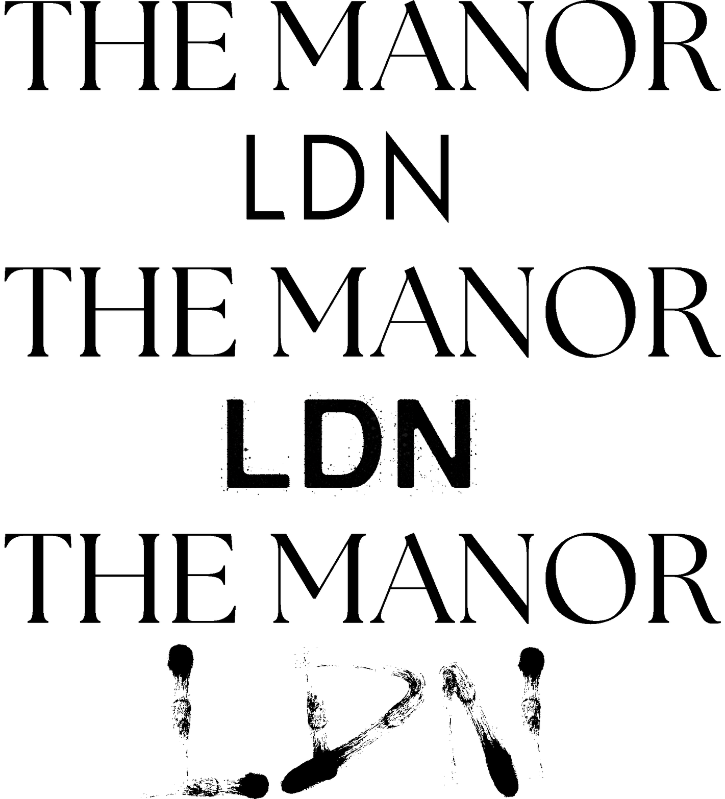
THE MANOR LDN

PROJECT PROJECTION


The Manor London identity was developed as a complete brand system, beginning with a logo concept built around the visual language of spotlights, performance and focus. That central idea carries through the wider branding, where light, shadow, contrast and controlled movement are used to create a distinctive visual language for a contemporary London dance studio. Rather than treating the logo, brand identity and digital experience as separate pieces, each element was designed to reinforce the same creative direction and build a more recognisable presence across print, social and digital applications.


The UI and web design continue that system through structured grids, expressive scale, overlapping imagery and carefully controlled typography, balancing clarity with the energy of live performance. The result is a future-facing brand identity designed to give The Manor a stronger foundation for growth and position it more confidently within London’s dance, performing arts and entertainment scene. From logo design and visual identity through to UI design and digital branding, the project aims to create a cohesive platform that can evolve with the studio while remaining distinctive, memorable and culturally relevant.